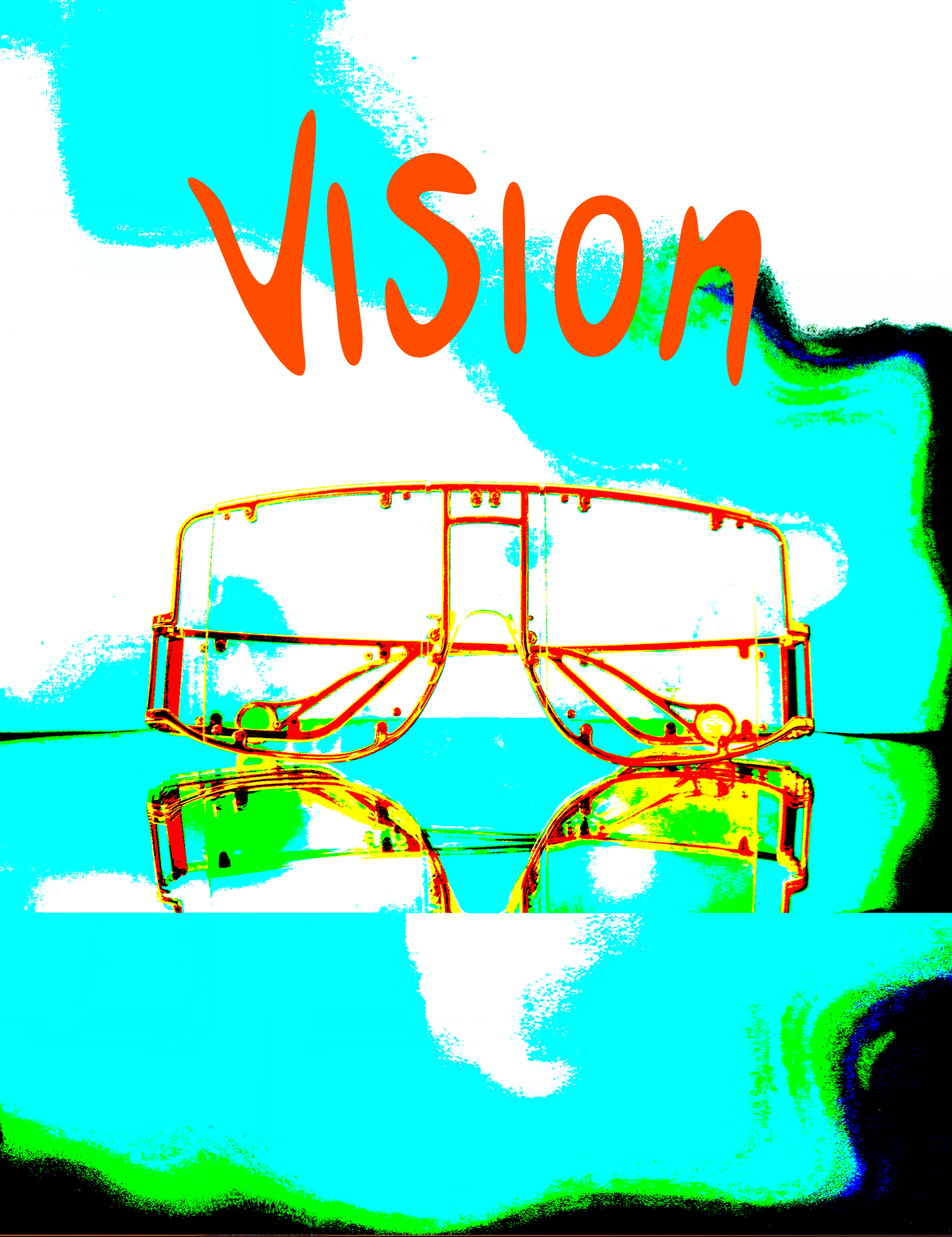
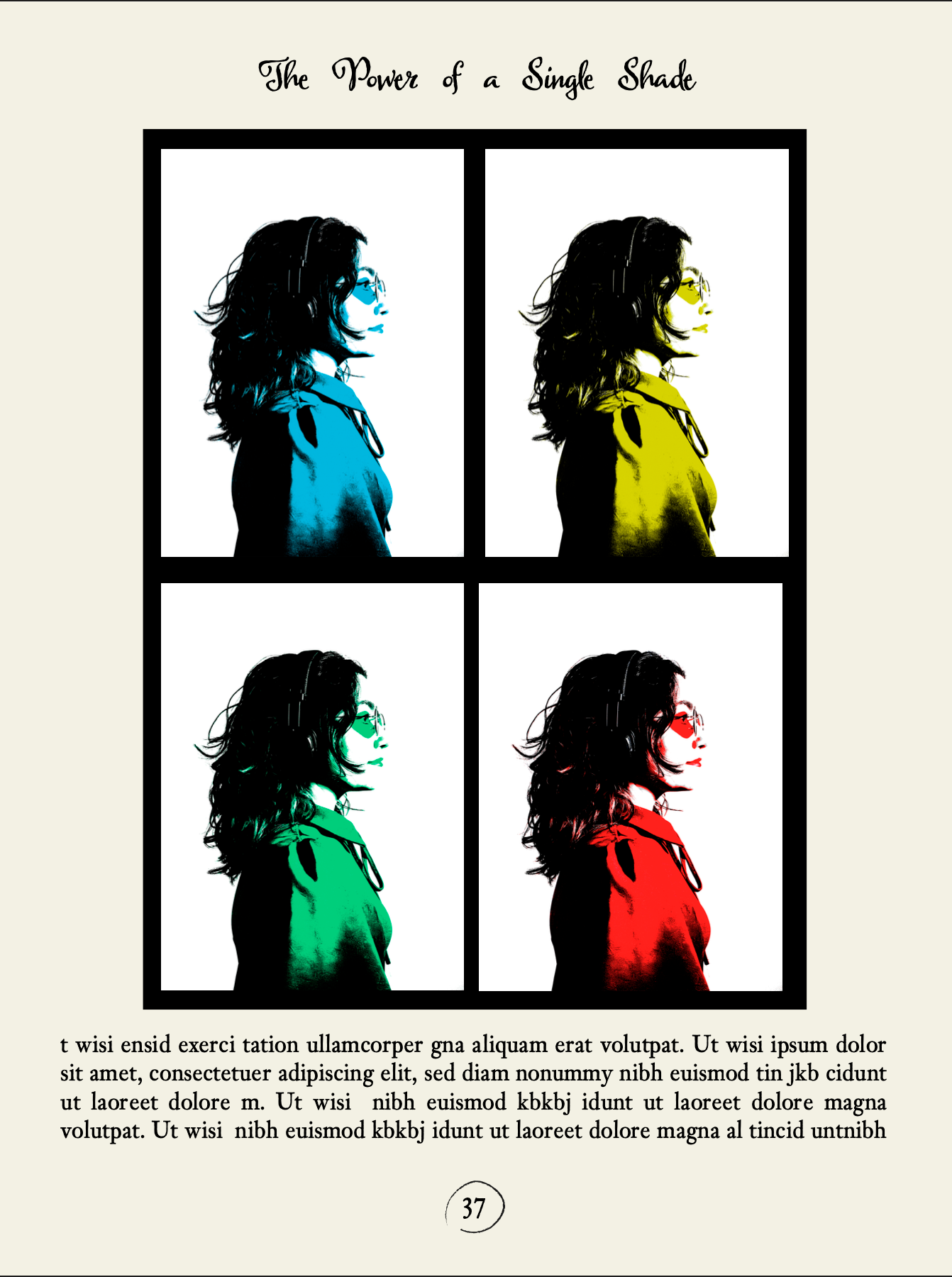
PRINT ADVERTISING STUDIES
This study examines the manipulation of images to create striking print advertising designs. It focuses on increasing color saturation to produce vibrant visuals that blend a retro feel with a futuristic style. The use of bold, bright colors helps achieve this unique look. Typography is carefully chosen to match and enhance the overall mood of the images, supporting a cohesive and engaging design.


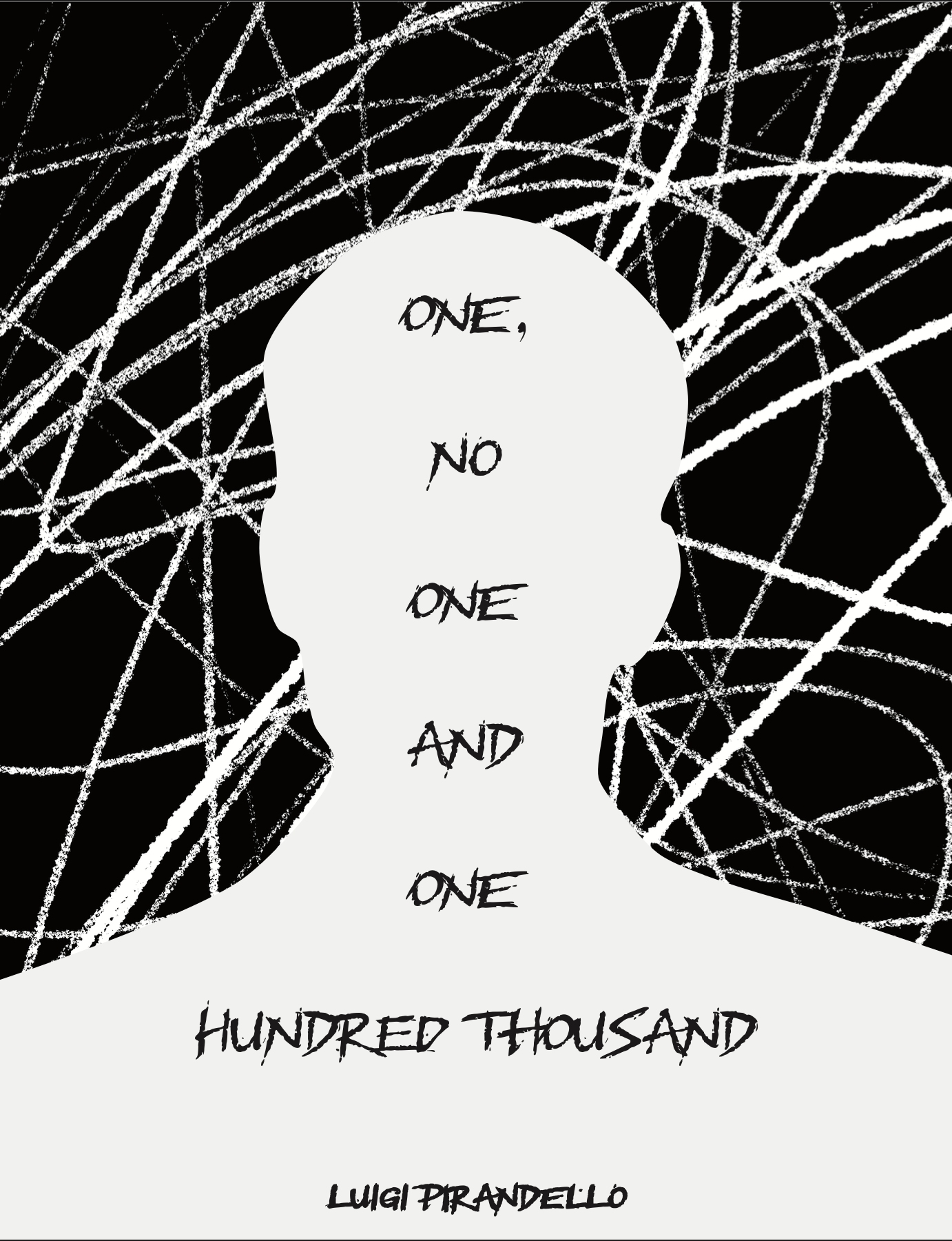
BOOK COVER STUDY
This study showcases book covers I designed inspired by famous books, featuring references to well-known characters and themes. The designs use simple, limited color palettes and carefully crafted typography that fits the context, becoming an integral part of the overall design. The goal is to create covers that are visually appealing and effectively convey the mood and essence of each book.


COMMERCIAL POP STUDY
This study focuses on referencing the commercialization of original products by transforming photographs into a new style. It involves tracing the outlines of the photos to create 2D drawings of both the photograph and the marketed product. Bright, vibrant colors inspired by the 1970s are then applied, resulting in a design that blends retro and modern styles.


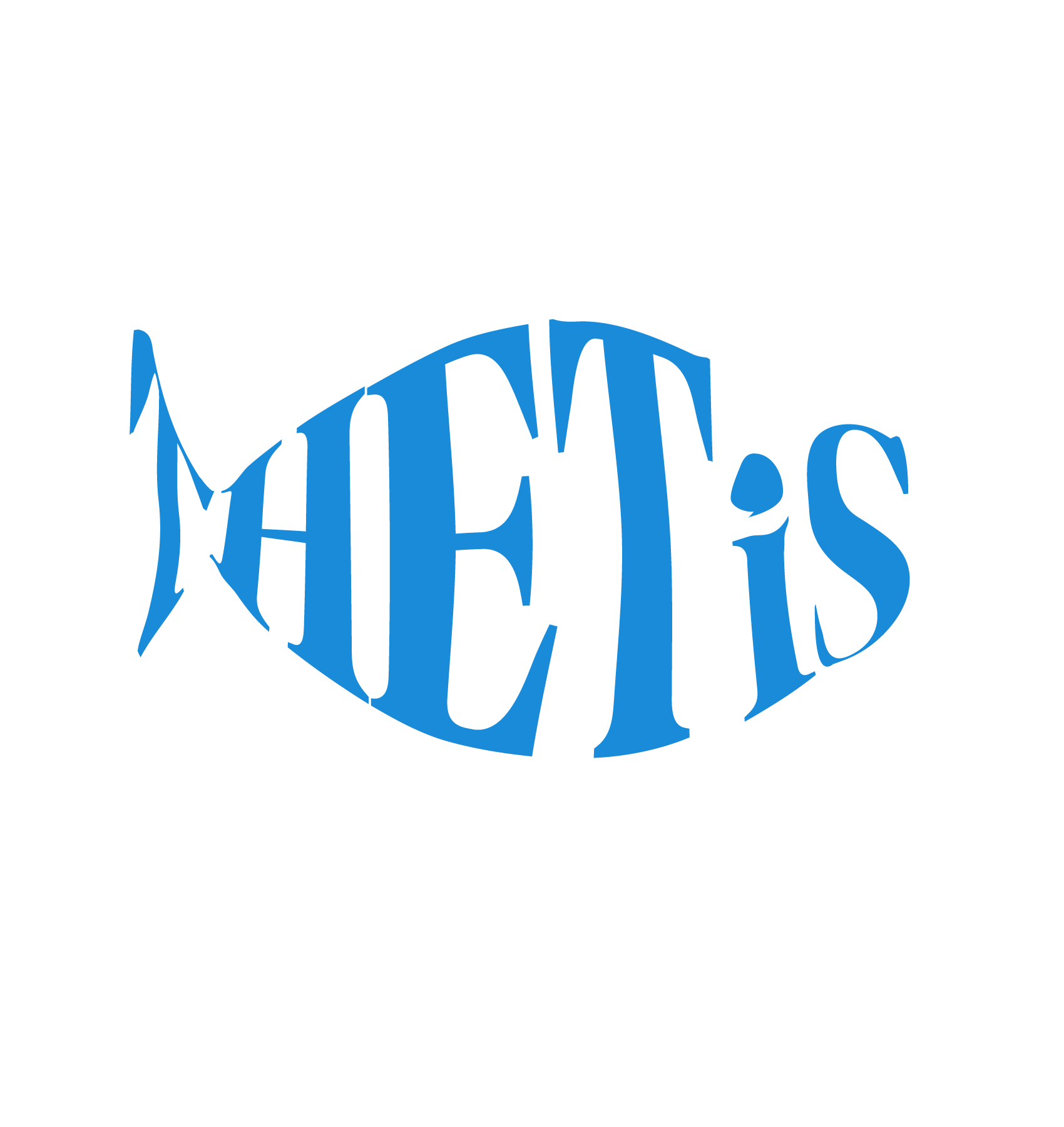
LOGO DESIGN STUDY
These three logo design studies all refer to the same restaurant, which specializes in seafood. The designs incorporate typical marine imagery to reflect the restaurant’s focus. Typography is integrated into the overall design, becoming a key visual element alongside the illustrations. Additionally, a blue color tone was chosen to evoke the feeling of the sea.


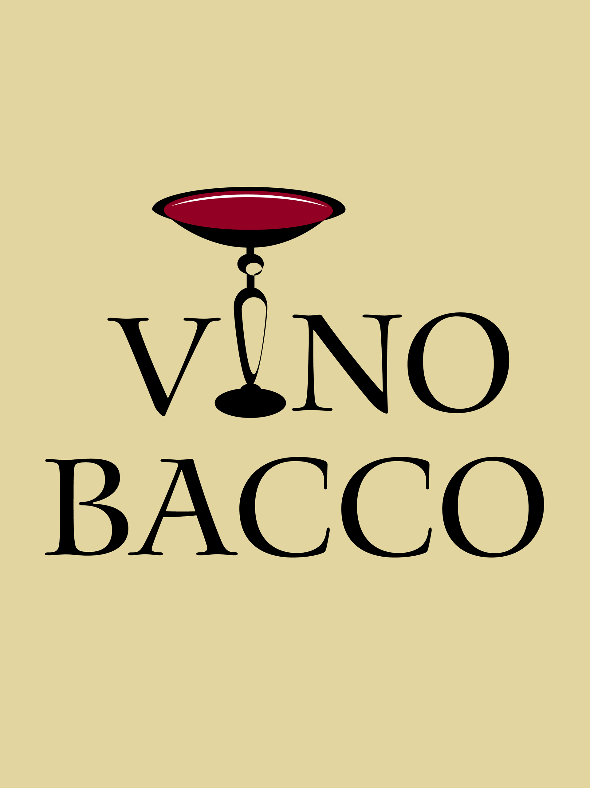
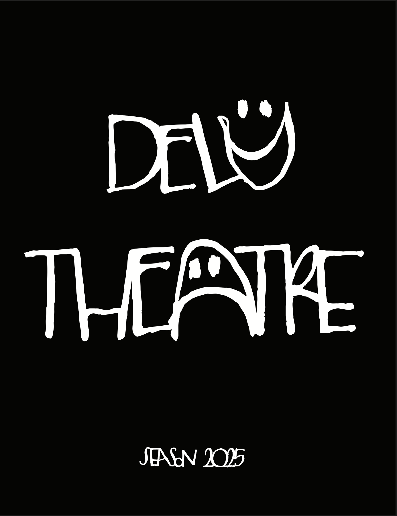
LOGO POSTER DESIGN
These logo designs are part of a study for two different brands. The first logo is for a wine product, where the design references a wine glass commonly associated with Bacchus, the god of wine. This connection fits well with the brand name, “Vino Bacco.” The colors used are soft and muted, with red as the standout color symbolizing the wine itself.
The second logo is for an improvisation theater named “Delu.” The name is ideal because it has no specific meaning, reflecting the unpredictable nature of improvisation. The typography is designed to complement two illustrated masks representing traditional theatrical expressions—happy and sad—yet with a modern, urban twist. The color palette is limited to black and white, emphasizing simplicity and contrast.
This typography study references Leonardo da Vinci’s Vitruvian Man, as the font used is Italian Old Style, which relates to the Renaissance period—Leonardo’s era. The geometric shapes that compose the design reflect the history and characteristics of the font itself. In this work, the typography is creatively manipulated to convey this connection
TYPOGRAPHY STUDY

MAGAZINE LAYOUT STUDY
This magazine layout study draws inspiration from fashion magazines that often employ subdued color palettes. In contrast, the images are vibrant and richly colored to create a striking visual impact and capture the viewer’s attention immediately. The typography is carefully selected to evoke a musical vibe, enhancing the overall mood and cohesiveness of the design.

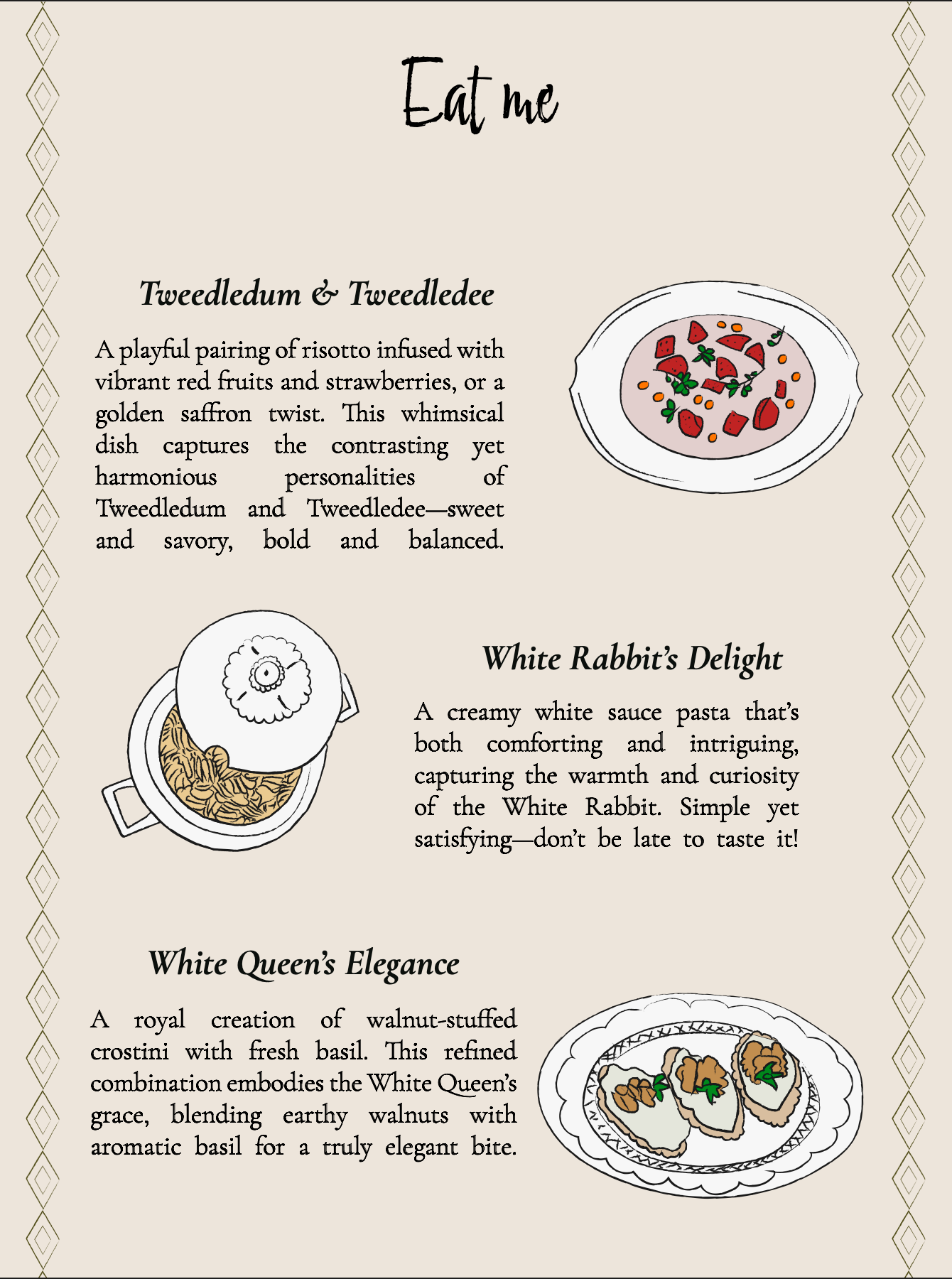
MENU DESIGN STUDY
This menu design study is inspired by Alice in Wonderland and begins with a thoughtful exploration of dish and drink names. The visual elements were developed by tracing product images into detailed 2D illustrations that blend a stylized, illustrative approach with realistic qualities, utilizing bright and vibrant colors. The concept envisions this menu as part of a special occasion or themed bar, capturing the whimsical and imaginative spirit of Alice in Wonderland through both design and content.